projects
visual arts
Marcel Knauf
Lisa-Marie Müller
Benno Ulitzka
The Visual Arts group was responsible for the visual design of the elements for the MAMAgotchi project.
The visual arts team is responsible for branding, character design (including animations), backgrounds, UI concepts, and providing general support to other teams with design-related issues for the MAMAgotchi project. The team’s main task is to tailor the visual style precisely to the target audience of 7- to 11-year-olds.
Art Style
The visual concept is based on a layered paper cutout look that bridges the gap between the digital screen and the physical room installation. The color palette draws directly from the classic arts-and-crafts cabinet: We use the full range of bold, rich colors found in traditional construction paper. The goal is a timeless, vibrant, and above all, tangible look. To precisely convey this analog character in the graphics, we employ three design principles:
- We layer the shapes on top of one another exactly as in real paper cutouts.
- Subtle drop shadows cleanly separate the individual layers without visually overloading the interface.
- Gentle textures break up the smooth digital color surfaces and provide the necessary visual grip.
Logo
Visually, the logo is divided into two contrasting sections: “MAMA” and “gotchi”. The “MAMA” lettering is rendered in solid, orderly black and conveys the stability, structure, and security of a mother. In contrast, the “gotchi” portion was actually handwritten by a child. It embodies the playful, unique, and adaptable side that symbolizes the open and lively dynamic between mother and child.
Background
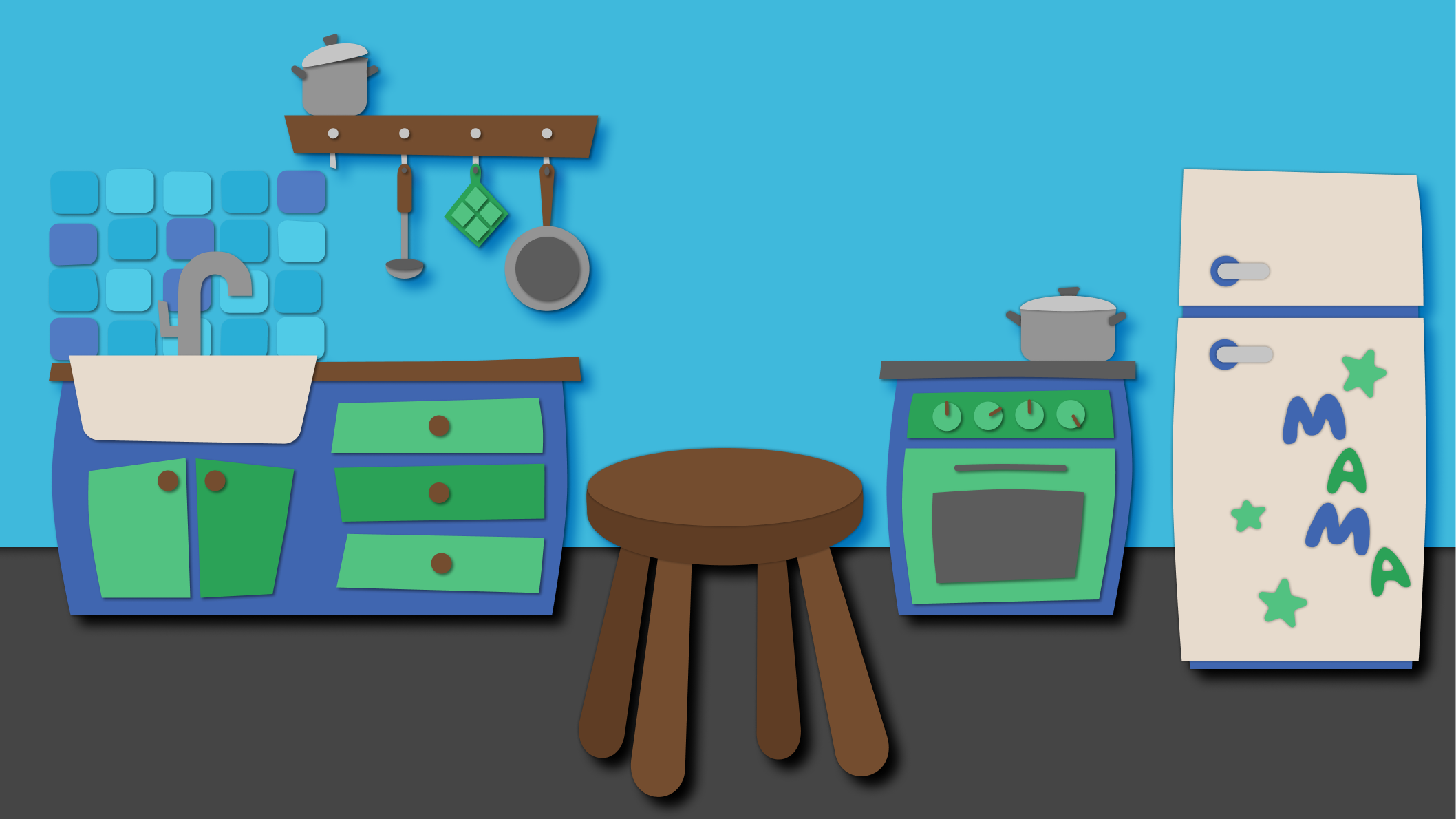
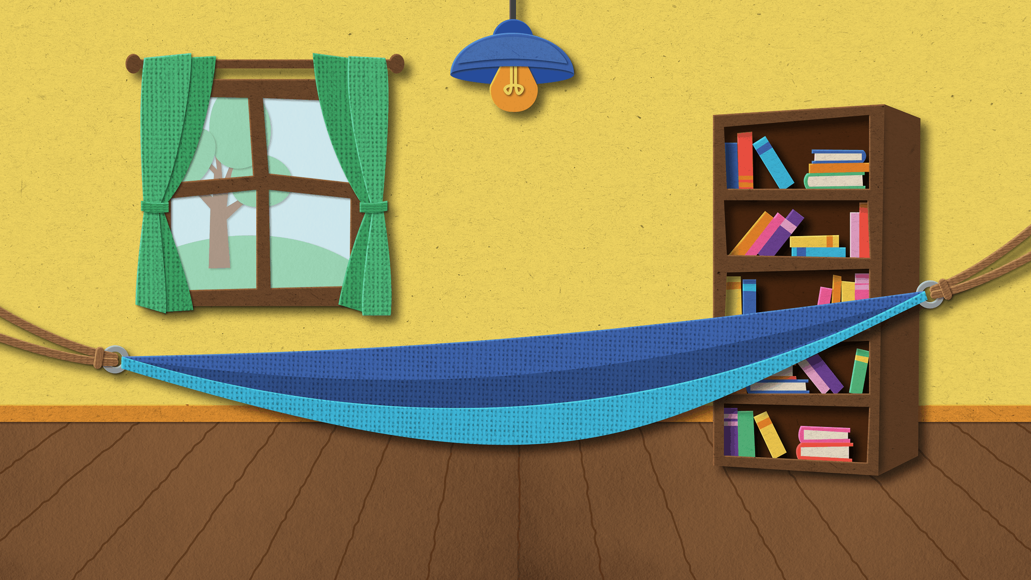
For the backgrounds, we deliberately avoid symmetry and perfect order to prevent a sterile appearance. As with the character itself, all objects are created from simple geometric shapes that are intentionally layered on top of one another at an angle. Together with the colorful construction paper palette, this is intended to make the setting appear lively and handmade.
In the kitchen (see Figure 2), the Gotchi sits on a wooden stool. A variety of typical kitchen elements make the room instantly recognizable without visually overloading the composition.
The playroom (see Figure 3) is designed for a significantly larger screen display. Since various UI elements are also integrated here, the rest of the room’s design is deliberately kept minimal so that the overall image doesn’t appear cluttered. Unlike in the kitchen, the Gotchi is placed in a hammock here. The larger on-screen display also makes it possible to add subtle textures to the individual elements.
Main Display Concept
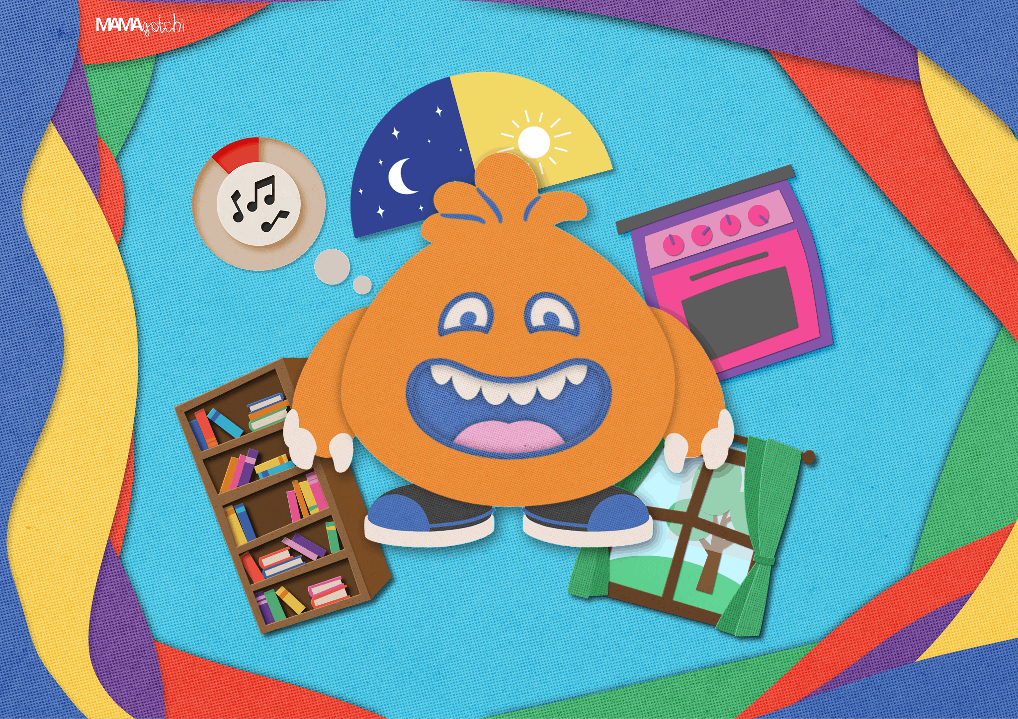
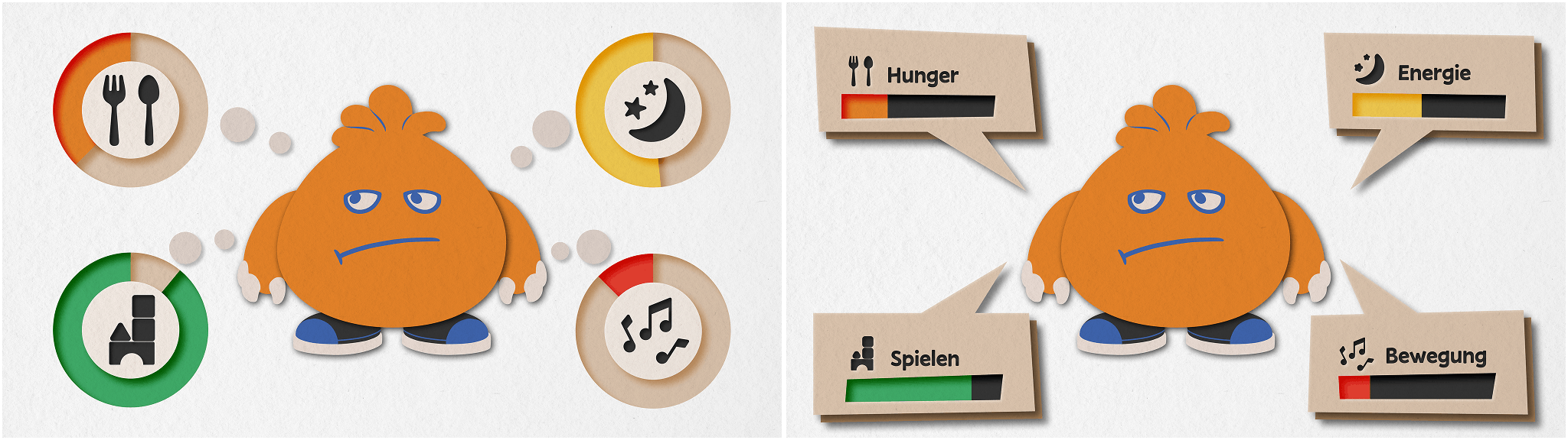
The biggest challenge with the main view was to convey the four status values (saturation, energy, play, and movement) in an easy-to-understand way so that children could grasp the data immediately. To achieve this, two different design concepts (see Figure 4) were developed. Both versions place the Gotchi in the center and arrange the needs in a circle around it. Simple, minimalist icons ensure that users can quickly identify the individual stations.
The concepts differ in the visual implementation of the displays:
- Variant A uses thought bubbles in which a pie charts serves as a scaling system.
- Variant B uses speech bubbles with classic bars as fill-level indicator.
In addition to the fill level, both designs use an intuitive traffic-light system ranging from red to green. This color-coding ensures that children can identify the most urgent need for action at a glance, without requiring additional explanations. Ultimately, Variant A was chosen, and text labels were completely avoided.
Character Design
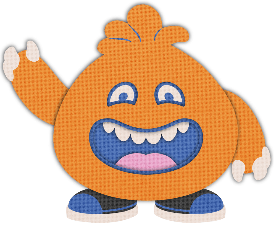
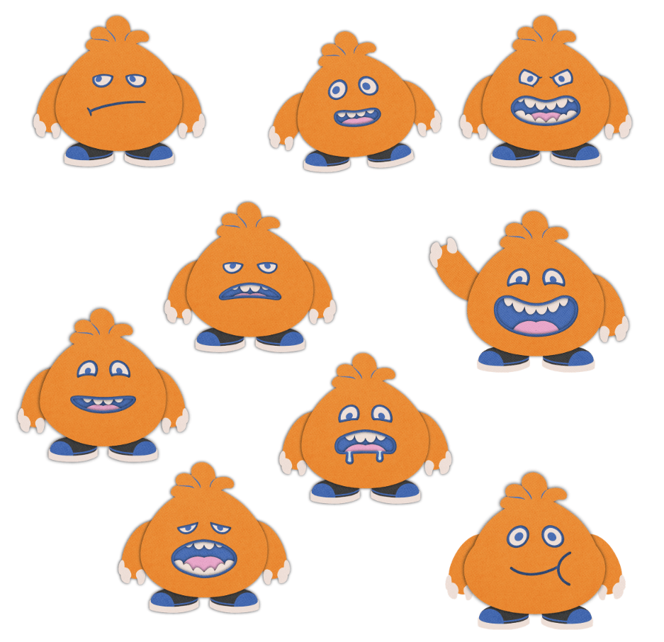
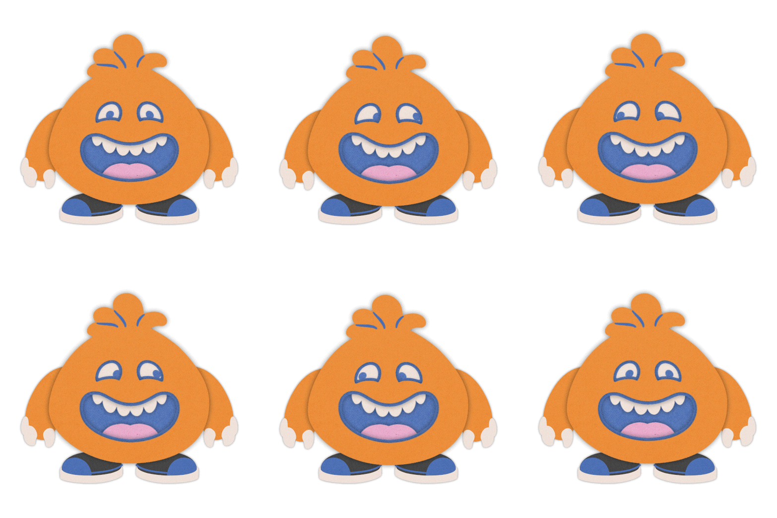
The focus is on the Gotchi, an orange creature made up of simple, overlapping geometric shapes (see Figure 5). Its appearance is intentionally reminiscent of a paper figure crafted by children. Since the character essentially consists of a face with arms and legs, the focus is entirely on its facial expressions. These are the primary tool for communicating the Gotchi’s needs and desires to the target audience without the use of text. For each individual status value, we developed specific facial expressions (see Figure 6) that directly reflect the Gotchi’s state of mind and are displayed as short, animated loops. In addition, activities such as eating were animated to support analog interaction at the stations with digital feedback.
Animations
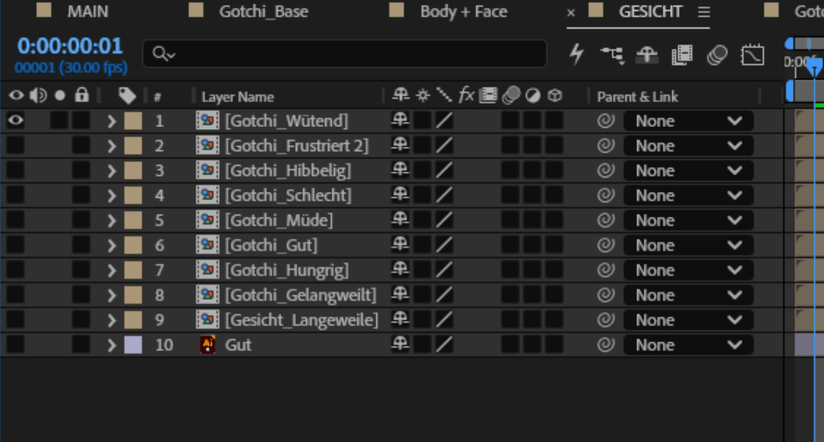
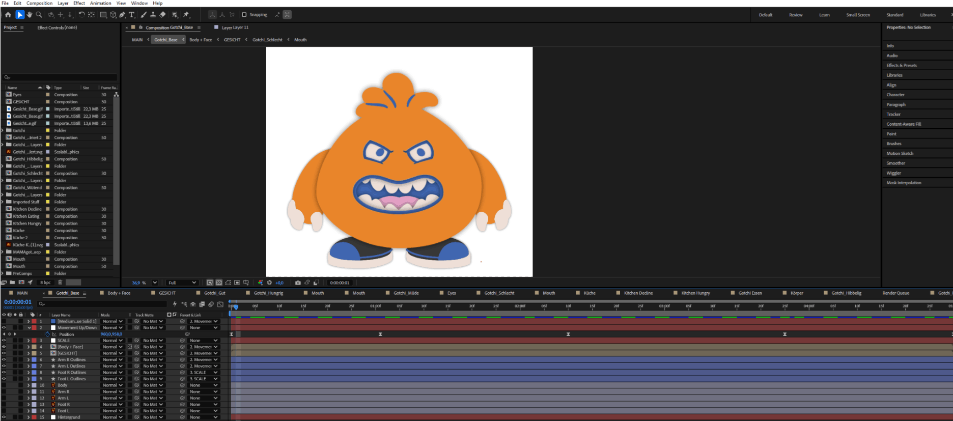
The animations bring the Gotchi to life. The character is a round, soft-shaped orange creature, kept simple in body so its face can carry the emotion. The face sits in its own layer, separate from the body, and can be swapped freely (see Figure 7). Each version shows a different state: good, hungry, tired, angry, frustrated, bored, restless, or bad. As children interact with the stations, the face changes to show how the Gotchi feels.
Behind the scenes, the setup goes deep. Some elements are nested up to six layers, all built to be combined, swapped, and reused without redoing the whole animation. That structure made it possible for the Gotchi to react to many different situations without becoming unmanageable (see Figure 8).
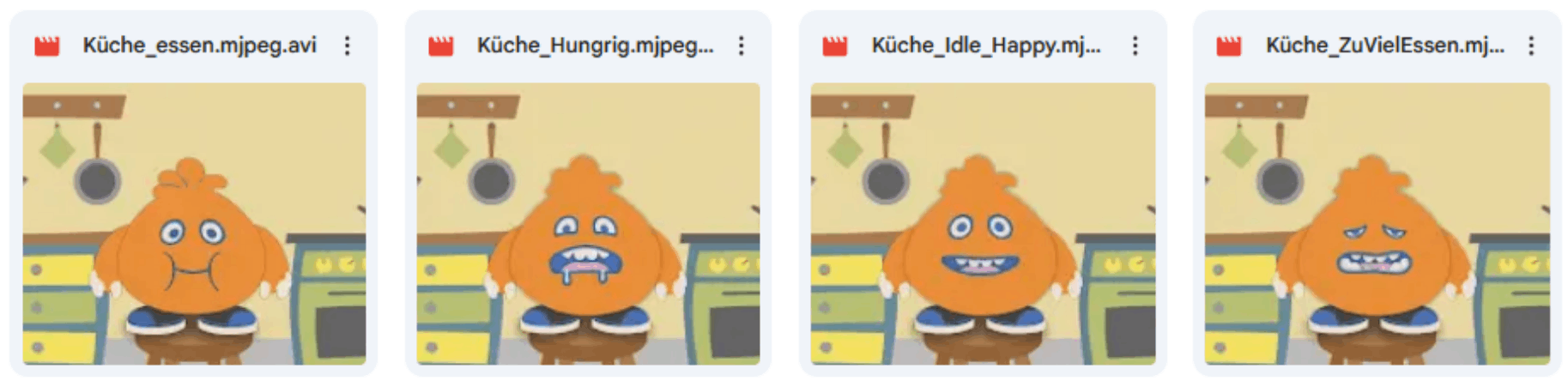
One station got its own dedicated set of animations: the kitchen. Here, the Gotchi eats, gets hungry, sits happily, or reacts when fed too much. Each scene gives the feeding station its own visual feedback, tuned to that specific moment of care (see Figure 9).
Tool-Stack
Various tools and collaborative methods were used throughout the design processes:
- The team met in person for the first brainstorming sessions to agree on the core ideas, such as what art style to use and what the Gotchi should look like. On the collaborative platform Miro, these influences were compiled into a shared mood board to establish the stylistic direction within the team. Sources of inspiration included websites such as Pinterest and AI-generated content.
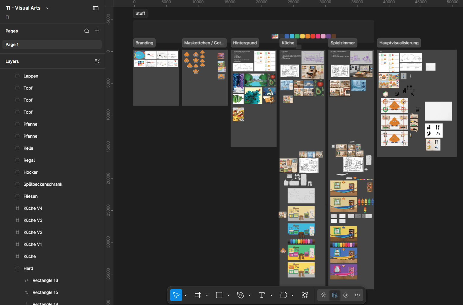
- Some of the early interface sketches and concepts were developed in Figma. The final room backgrounds for the kitchen and the playroom were also created here as layer-based vector compositions (see Figure 11).
- The Gotchi character was designed in Inkscape and refined in Adobe Illustrator.
- The individual facial features, emotional reactions, and UI states were animated in Adobe After Effects as seamless loops.
The Book
The branding book brings the project together. It presents the visual identity and gives a short summary of each team’s approach within the project. It works as a compact overview, showing how the different ideas connect into one shared concept.
Conclusion
The Visual Arts team developed a cohesive, tactile visual identity in an analog paper-cutout style for the MAMAgotchi project. A clear division of labor in the design process enabled the team to efficiently create a wide variety of graphics and numerous animations. All finished elements are available in the design repository and were integrated into the physical installations by the other groups.
Repository
All visual design work can be found in our design repository: MAMAgotchi - Design Repository
Disclosure Statement
This text was prepared with the assistance of the AI language model 3.5 Flash (Gemini), which was used for linguistic revision. The authors defined the content requirements and remain responsible for the final version.